paired sample t test, R programming, data analysis, hypothesis testing, hypothermia, boxplot, removing outliers, identify outliers
In this blog post, we will perform a paired samples t-test using R to analyze the difference between two related groups. The dataset contains temperature measurements (t.1 and t.2) taken before and after an intervention. We will also calculate the confidence interval for the mean difference and visualize the results.
Load the Data
First, we load the dataset into R. The dataset contains temperature measurements for 200 cases.
# Load the datasetdf <-read_csv("data/Hypothermia.csv")# Display the first few rows of the datasethead(df)
# A tibble: 6 × 13
   case  code  date  time weight t.nur  t.or   t.1   t.2   t.3   t.4   t.5   t.6
  <dbl> <dbl> <dbl> <dbl>  <dbl> <dbl> <dbl> <dbl> <dbl> <dbl> <dbl> <dbl> <dbl>
1     1 98887    12  20.3   2550    29    28  34    35.1  NA    NA      NA  NA
2     2 98528    11  18.1   1200    29    23  29    33    36.5  36.8    NA  NA
3     3 95723     3  10.2   2650    31    32  31    36.8  NA    NA      NA  NA
4     4 97694     8   0.3    800    27    22  32    34    35    35.5    36  36.5
5     5 96892     6   6.2   1880    30    30  32.2  36.6  NA    NA      NA  NA
6     6    NA     4  11      680    30    32  34    35.2  36.5  36.9    NA  NA
Identify and Remove Outliers
Reshape the Data
We select only the columns t.1 (temperature before intervention) and t.2 (temperature after intervention) from the dataset. This function reshapes the data from wide format to long format.
# Reshape the data for visualizationdf_long <- df %>%select(t.1, t.2) %>%pivot_longer(cols =c(t.1, t.2), names_to ="time", values_to ="temperature")head(df_long)
# A tibble: 6 × 2
  time  temperature
  <chr>       <dbl>
1 t.1          34
2 t.2          35.1
3 t.1          29
4 t.2          33
5 t.1          31
6 t.2          36.8
Create a Boxplot
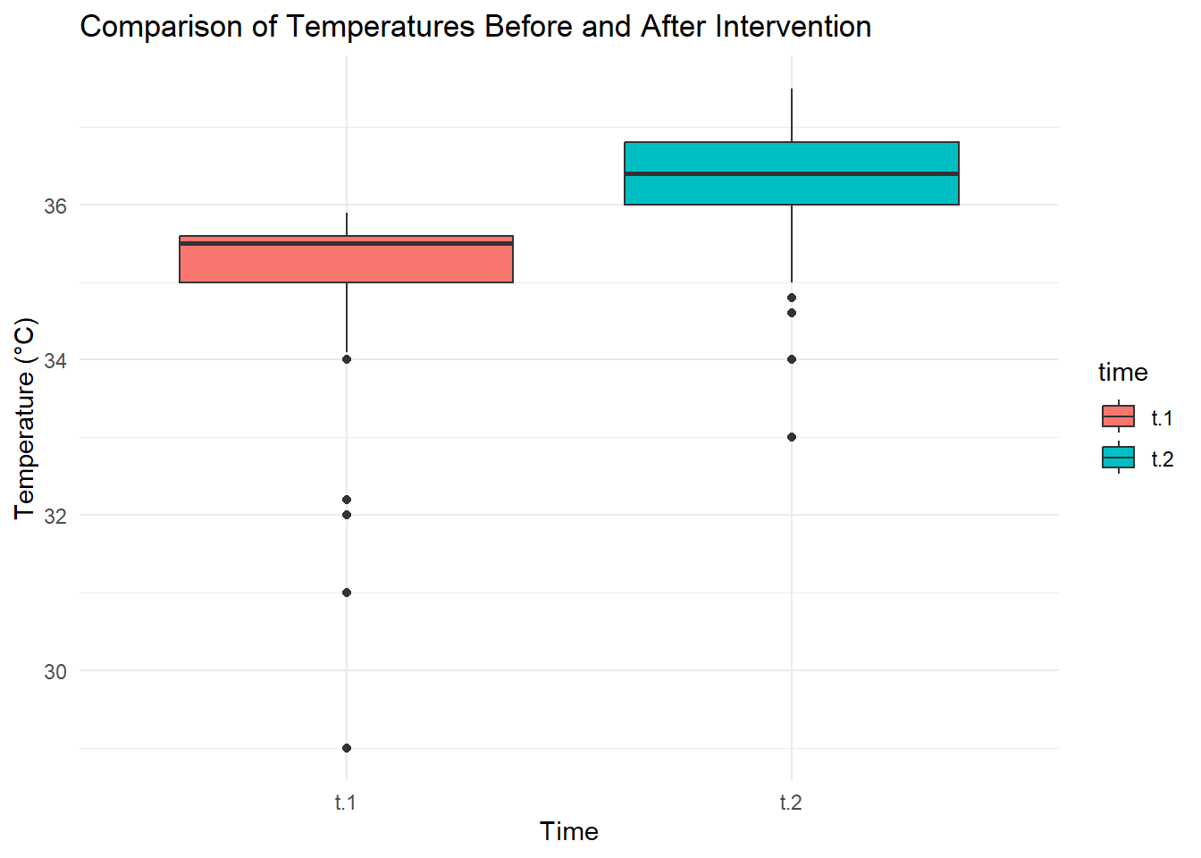
To better understand the data, we create a boxplot to visualize the distribution of temperatures before and after the intervention.
# Create a boxplotggplot(df_long, aes(x = time, y = temperature, fill = time)) +geom_boxplot() +labs(title ="Comparison of Temperatures Before and After Intervention",x ="Time",y ="Temperature (°C)") +theme_minimal()
Boxplot Interpretation:
The boxplot displays the distribution of temperatures for t.1 and t.2.
Outliers are represented as individual points outside the “whiskers” of the boxplot.
The whiskers extend to 1.5 times the interquartile range (IQR) from the quartiles (Q1 and Q3). Any data point beyond this range is considered an outlier.
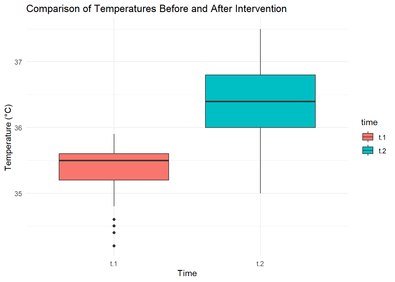
Remove outliers
First we shall create a function that can be used to identify the outliers using the Interquartile Range (IQR) method and remove them before proceeding with the analysis.
# Function to identify outliers using the IQR methodremove_outliers <-function(x) { Q1 <-quantile(x, 0.25, na.rm =TRUE) Q3 <-quantile(x, 0.75, na.rm =TRUE) IQR <- Q3 - Q1 lower_bound <- Q1 -1.5* IQR upper_bound <- Q3 +1.5* IQR x[x < lower_bound | x > upper_bound] <-NAreturn(x)}# Remove outliers from t.1 and t.2df <- df %>%mutate(t.1 =remove_outliers(t.1),t.2 =remove_outliers(t.2) ) %>%filter(!is.na(t.1) &!is.na(t.2)) # Remove rows with NA values
Now let’s take a look at the cleaned data set.
# Reshape the data for visualizationdf_long <- df %>%select(t.1, t.2) %>%pivot_longer(cols =c(t.1, t.2), names_to ="time", values_to ="temperature")# Create a boxplotggplot(df_long, aes(x = time, y = temperature, fill = time)) +geom_boxplot() +labs(title ="Comparison of Temperatures Before and After Intervention",x ="Time",y ="Temperature (°C)") +theme_minimal()
Perform the Paired Samples t-test
We will compare the temperatures before (t.1) and after (t.2) the intervention using a paired samples t-test. The alternative hypothesis is that the mean temperature after the intervention is greater than before.
    Paired t-test

data:  df$t.2 and df$t.1
t = 27.914, df = 187, p-value < 2.2e-16
alternative hypothesis: true mean difference is greater than 0
95 percent confidence interval:
 0.9367768       Inf
sample estimates:
mean difference
      0.9957447
Results of the t-test:
t-statistic: 27.9136261
p-value: 0
The p-value is extremely small (< 0.05), indicating that we reject the null hypothesis. There is a statistically significant difference between the temperatures before and after the intervention.
Calculate the Confidence Interval for the Mean Difference
Next, we calculate the 95% confidence interval for the mean difference between t.2 and t.1.
# Calculate the differencesdf <- df %>%mutate(differences = t.2- t.1)# Compute the mean difference and confidence intervalmean_diff <-mean(df$differences, na.rm =TRUE)ci <-t.test(df$differences, conf.level =0.95)$conf.int# Display the resultscat("Mean of Differences:", round(mean_diff, 2), "\n")
The mean difference in temperatures is 1 degrees, with a 95% confidence interval ranging from 0.93 to 1.07. This suggests that the intervention significantly increased the temperature.
Conclusion
The paired samples t-test revealed a statistically significant increase in temperatures after the intervention (t-statistic = 27.91, p-value < 0.05). The mean difference in temperatures was 1 degrees, with a 95% confidence interval of 0.93, 1.07. This suggests that the intervention was effective in raising temperatures. The boxplot further supports this conclusion by showing a clear increase in median temperatures after the intervention. The analysis provides strong evidence that the intervention had a significant positive effect on temperatures.