install.packages("ggplot2")Creating Stunning Visualizations with ggplot2
Scatter plot
Barplot
Line plot
Tutorials
Learn how to create impactful visualizations using ggplot2 in R. From basic plots to advanced customization, this tutorial will guide you step-by-step to master data visualization techniques.
Keywords
ggplot2 tutorial, Data visualization in R, R programming plots, Customizing ggplot2 themes, Interactive plots with plotly, Creating bar plots in R, Faceted plots in ggplot2, Data storytelling with R
Data visualization is a cornerstone of data analysis and storytelling. In R, the ggplot2 package is a powerful and flexible tool for creating stunning and customizable visualizations. This tutorial will guide you through the essentials of ggplot2, from creating basic plots to advanced customizations, and even making your plots interactive.
What is ggplot2?
ggplot2 is part of the tidyverse and is based on the Grammar of Graphics, which allows you to construct plots layer by layer. This structured approach makes it easy to create complex visualizations from data.
Getting Started with ggplot2
Installation and Setup
Before we start, make sure to install the ggplot2 package if you haven’t already:
Load the library:
library(ggplot2)For this tutorial, we will use the built-in mtcars dataset, which contains data on car performance.
Step 1: Creating Basic Visualizations
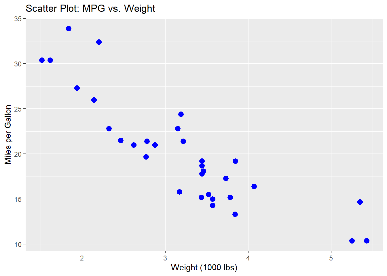
Scatter Plot
A scatter plot helps visualize the relationship between two continuous variables.
# Scatter plot of mpg (miles per gallon) vs. wt (weight)
ggplot(mtcars, aes(x = wt, y = mpg)) +
  geom_point(color = "blue", size = 3) +
  labs(
    title = "Scatter Plot: MPG vs. Weight",
    x = "Weight (1000 lbs)",
    y = "Miles per Gallon"
  )
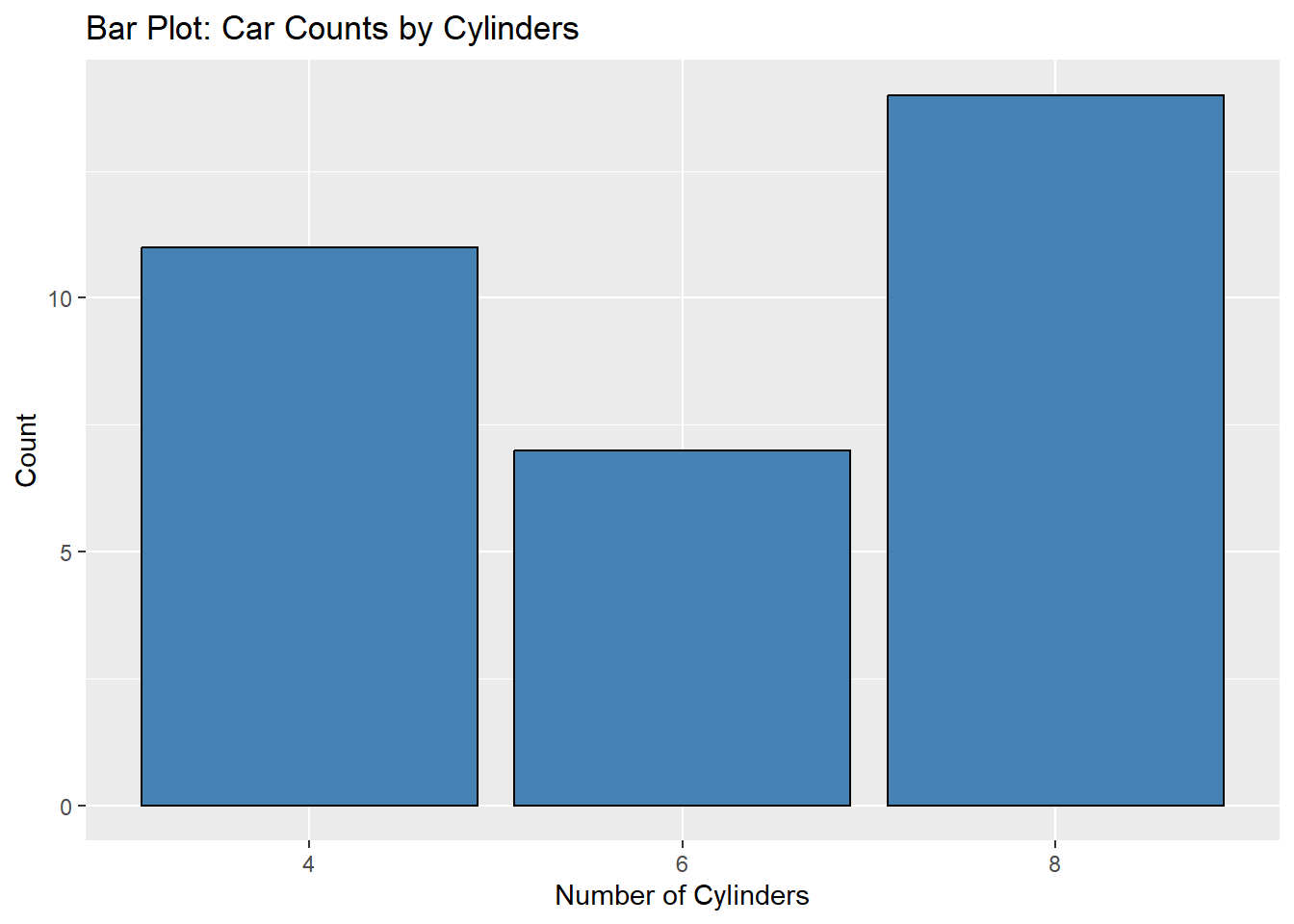
Bar Plot
A bar plot is great for comparing categorical data.
# Bar plot of car counts by the number of cylinders
ggplot(mtcars, aes(x = factor(cyl))) +
  geom_bar(fill = "steelblue", color = "black") +
  labs(
    title = "Bar Plot: Car Counts by Cylinders",
    x = "Number of Cylinders",
    y = "Count"
  )
Line Plot
A line plot is useful for showing trends over time or sequential data.
# Line plot of horsepower (hp) by weight (wt)
ggplot(mtcars, aes(x = wt, y = hp)) +
  geom_line(color = "darkgreen", size = 1) +
  labs(
    title = "Line Plot: Horsepower by Weight",
    x = "Weight (1000 lbs)",
    y = "Horsepower"
  )
Warning: Using `size` aesthetic for lines was deprecated in ggplot2 3.4.0.
ℹ Please use `linewidth` instead.
Step 2: Customizing Plots
Adding Colors and Shapes
Customizing the aesthetics of a plot can make it more engaging.
# Customizing scatter plot with colors and shapes
ggplot(mtcars, aes(x = wt, y = mpg, color = factor(cyl), shape = factor(gear))) +
  geom_point(size = 4) +
  labs(
    title = "Customized Scatter Plot: MPG vs. Weight",
    color = "Cylinders",
    shape = "Gears",
    x = "Weight (1000 lbs)",
    y = "Miles per Gallon"
  )
Applying Themes
Themes control the overall appearance of a plot.
# Applying a minimal theme
ggplot(mtcars, aes(x = wt, y = mpg)) +
  geom_point(color = "blue", size = 3) +
  labs(
    title = "Scatter Plot with Minimal Theme",
    x = "Weight (1000 lbs)",
    y = "Miles per Gallon"
  ) +
  theme_minimal()
Step 3: Advanced Visualizations
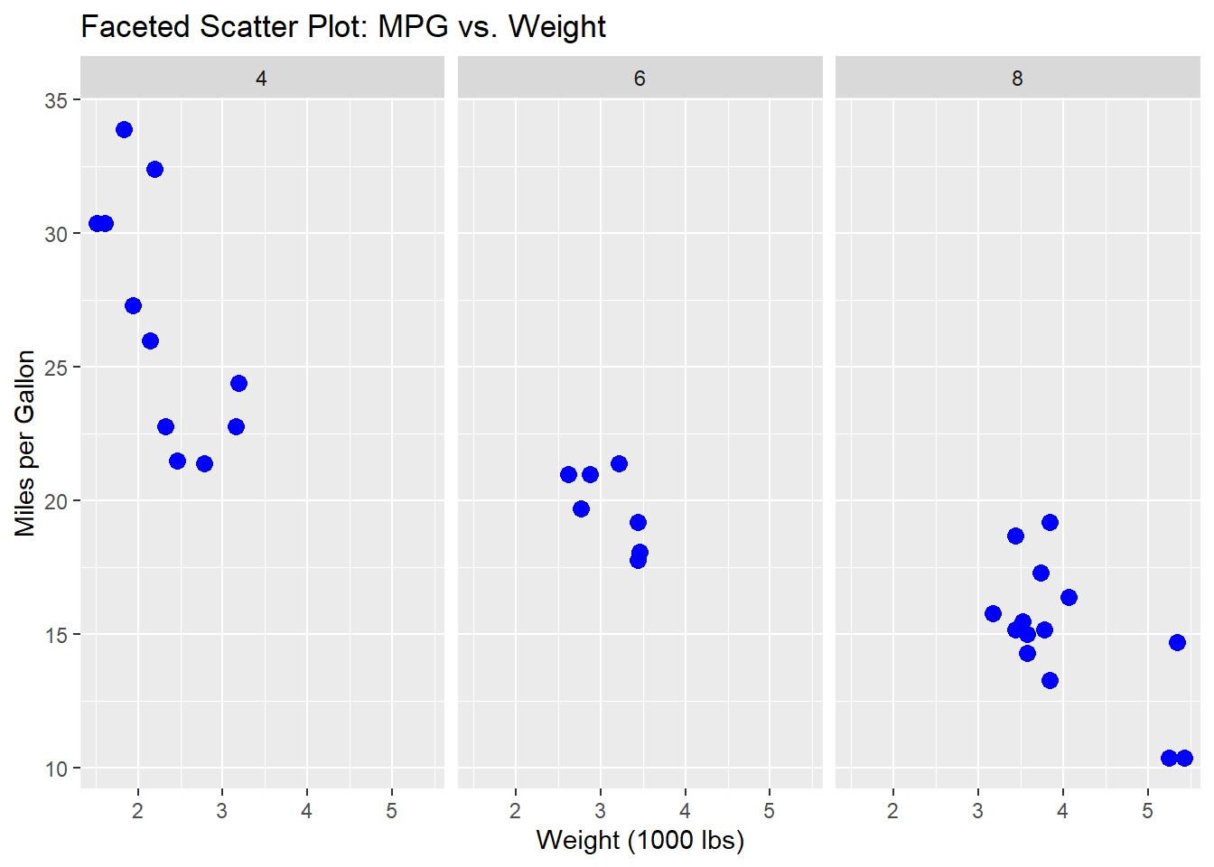
Faceted Plots
Faceting splits data into subplots based on a categorical variable.
# Faceted scatter plot by number of cylinders
ggplot(mtcars, aes(x = wt, y = mpg)) +
  geom_point(color = "blue", size = 3) +
  facet_wrap(~ cyl) +
  labs(
    title = "Faceted Scatter Plot: MPG vs. Weight",
    x = "Weight (1000 lbs)",
    y = "Miles per Gallon"
  )
Combining Multiple Geoms
You can layer multiple geometric objects (geoms) in one plot.
# Scatter plot with a regression line
ggplot(mtcars, aes(x = wt, y = mpg)) +
  geom_point(color = "blue", size = 3) +
  geom_smooth(method = "lm", se = FALSE, color = "red") +
  labs(
    title = "Scatter Plot with Regression Line",
    x = "Weight (1000 lbs)",
    y = "Miles per Gallon"
  ) +
          theme_bw()
`geom_smooth()` using formula = 'y ~ x'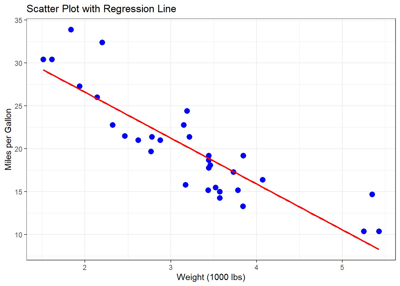
Step 4: Interactive Visualizations
Install the plotly package by running below command in R console.
# Install and load plotly
install.packages("plotly")
To make plots interactive, use the plotly package.
library(plotly)

# Convert a ggplot to an interactive plot
p <- ggplot(mtcars, aes(x = wt, y = mpg)) +
  geom_point(color = "blue", size = 3) +
  labs(
    title = "Interactive Scatter Plot: MPG vs. Weight",
    x = "Weight (1000 lbs)",
    y = "Miles per Gallon"
  )

ggplotly(p)
Conclusion
With ggplot2, you can create stunning and informative visualizations in R. From basic scatter plots to interactive dashboards, ggplot2 provides the tools you need to effectively communicate insights from your data. By mastering customization and themes, you can tailor your visualizations to meet any audience’s needs.
Start experimenting with ggplot2 today, and unlock the power of visualization to tell your data’s story!